Breatheit
ultopia
ui/ux and graphic design
overview
Ultopia is a wellness tracking app that focuses on a holistic approach to wellness. The app centers around 7 lifestyle categories: peace of mind, social relationships, finance, recreation, health, citizen responsibility, and personal brand. Ultopia utilizes gamification, including usage streaks and colorful progress bars, to keep users engaged daily. The app also includes organizational tools such as a planner, task list, and goal setting. In the recent redesign, an AI tool was added to give users personalized recommendations based on their responses in each category. I worked on the app’s homepage as well as graphics for each lifestyle category, organizational tools, and the app’s tour.
role
UI/UX Designer and Graphic Designer
Team

Designers, Engineers, CEO
Timeline
3.5 Months
Problem/Challenge
BreatheIT had success with the first version of their app, and wanted designers to work directly with the development team to increase production speed. BreatheIT wanted to focus on cleaner, more accessible pages, as well as updated visuals in the app. They aimed to increase user retention and attract new users. They also wanted the update ready by April 2025.
Tools
Figma, Adobe Firefly, Photoshop, Illustrator
Impact
My work contributed to a 40% increase in new users over 3 months and a 70% increase in funding.
Empathize-Define-Ideate-Prototype-Test
Empathize
My first step with this project was to hear from real users to understand their pain points and what they liked about the app. BreatheIT did not have the resources to interview many users, so I interviewed friends and family after a week of 10-minute daily use, and utilized reviews from the app store.
Colton, 26:
Colton finds the app bland and difficult to navigate. He struggles to understand what each tile represents due to poor visuals and a lack of information. After signing up, he had trouble navigating through the app and had trouble finding some key features. Colton found it difficult to remember to go into the app every day. He wants a cleaner and more visually appealing design, where tracking features are highlighted and a tour that shows users around at sign-up.
James, 60:
James appreciates the app’s function, and the variety of lifestyle aspects keeps him engaged. He is frustrated by disjointed design aspects, specifically blurry or stretched elements. He feels the journal and reflection of scores is helpful to keep him on track with his goals. He likes to utilize the time he takes to input information into the app to also work on his to-do list. James is Colorblind and has trouble differentiating between Reds and Greens. He would like to see a more structured layout with clear visuals and better contrast between design elements and the background.
Sarah, 43:
Sarah finds the app incredibly useful for keeping track of her self-care routine and ever-growing task list. She feels the app is user-friendly, but lacks personality and consistency. She has tracked elements of her lifestyle using different apps like Calm, MyFitnessPal, and WaterLlama, and is excited that there is an opportunity to have all her tracking in one place. She occasionally has trouble navigating between tiles and often clicks the wrong one in her hurriedness. Sarah is a mom of 2, and often finds herself doing her reflection in the few spare minutes she gets to herself, and appreciates that she can give herself a daily score and come back to reflect on it later.
Define
After hearing from users and learning more about stakeholder goals, I was able to compile a list of key features needed by all parties.
-
Cleaner and more accessible navigation.
-
Updated and properly sized graphics that clearly represent each lifestyle category.
-
An app tour that shows new and existing users all the features.
-
Multiple options for journaling that cater to a variety of users with different amounts of available time.
-
Organizing tools like a planner, goal-setting, and a habit tracker.
ideate
Persona: Jordan Matthews
Background:
Jordan is a fast-paced digital marketing manager at a growing tech startup, where they oversee multiple campaigns and client accounts. Their job requires constant multitasking, from analyzing performance metrics to coordinating with designers and content creators. Outside of work, Jordan values personal growth but often feels overwhelmed by the demands of daily life. They want to be more intentional about tracking personal goals, maintaining a healthy routine, and staying connected with loved ones.
technology use:
-
Heavy smartphone and laptop user, switching between multiple apps for work and personal organization.
-
Relies on Google Calendar, Notion, and Slack for work but finds them disconnected from personal needs.
-
Uses fitness apps like MyFitnessPal and Fitbit, but wants a more holistic lifestyle tracker.
-
Appreciates AI-driven recommendations to optimize scheduling and efficiency.
hobbies and interests:
-
Loves running and yoga but struggles with consistency.
-
Enjoys traveling and wants to plan trips more efficiently.
-
Likes reading self-improvement books and listening to productivity podcasts.
-
Regularly tries new restaurants and coffee shops but often forgets to track spending.
jordan's journey map
pain points:
-
Lives with a partner and a small dog, balancing quality time with a busy career.
-
Feels stretched between career growth, fitness goals, financial planning, and social life.
-
Wants to prioritize self-care and mental wellness but struggles to make time for it.
-
Finds it hard to track long-term progress across different life areas.


While working on this project, I encountered difficulties with stakeholders requesting immediate design without sufficient research or brainstorming. Our team held daily meetings, and due to the fast-paced nature of startups, designers were expected to have developed designs to present to the team. There was also a culture of competition between designers on this team, especially during the first month. This helped me learn to prototype quickly, but didn’t leave time for necessary research. The competition between designers also taught me the importance of being on a team that prioritizes collaboration and understands that research is a pivotal element in successful design.
Prototype
The first step of my process is to put pen to paper and create an initial sketch of the project. This allows my creativity to flow and encourages me to apply out-of-the-box thinking to complex situations.


Stakeholders like the look of square or slightly rectangular tiles, but they seem a bit cluttered and not intuitive for users. They want illustrations or images, instead of line icons, and want them to have a more human connection element.


Stakeholders thought this iteration was better, but still too chaotic. They liked the ideas for Finance, Health, Personal Assistant, and Organizer. They wanted one main element and to convey the holistic focus of the app. They wanted blue neon colors with minimal use of other colors. The biggest takeaway was that the tiles need to be easy for users to see and immediately understand.


Stakeholders did not like the human illustrations. They wanted to see similar illustrations with no humans. It was reiterated that the tiles need to be intuitive and users need to know what the tile represents without using words.


Stakeholders did not connect with these illustrations. They liked the minimal use of color, the ideas of a few tiles (Organizer, tasks, goals, finance), and the UX of the tiles being visible without scrolling. Stakeholders do not want to continue with the bottom navigation bar. Stakeholders want to move forward with imagery rather than illustrations.


Stakeholders liked these images. There were a few images that needed tweaking and color changes, but this was almost the final design. Stakeholders wanted to see different icons for the thumbs up and trophy.
test
After creating an initial set of wireframes, I completed usability testing using our persona, Jordan.
-
Too many steps to reach key information or features.
-
Limited integration with apps she already uses like Google Calendar or Fitbit.
-
Generic prompts that don’t feel tailored to her personal goals.
-
Clean, organized dashboard combining goals, wellness, and schedule in one place.
-
Smart, personalized insights that help optimize her time and habits.
-
Quick, intuitive task and reflection features that fit her busy lifestyle.
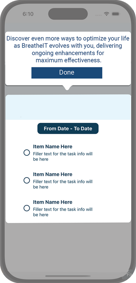
Final app

reflection
During my internship with BreatheIT, I learned a lot about myself and my process, as well as how the end-to-end production process really worked. Though there was a learning curve for the whole team to work with designers, and how to best utilize having two design interns at once, getting to collaborate with everyone on the team and have direct collaboration with developers helped me understand the back-end process as well as improve my ability to explain my design choices. This experience strengthened my ability to create visually engaging, user-friendly interfaces, and I’m excited to bring these refined skills into my future projects and career as a designer.
link to current app: https://apps.apple.com/us/app/ultopia/id6742277064