
Media43
web design
overview
Media43 is a Social Media and Brand Management company that offers Management and production services. They focus on medium to large (6,000-2.9M followers) Celebrities and Influencers. Their main goals are to help brands grow and develop their online presence through social media and branding.
role
Web Design and Development
Team
Web Designer, Graphic Designers, Founder, Social Media Managers, Brand Managers
Timeline
1.5 Months
Tools
Figma, GoDaddy, Canva, Photoshop
Problem/Challenge
Media43 was experiencing a decrease in engagement on their website, which was also contributing to a decrease in class enrollment and new clients. They were looking for a rebranded and simplified website that would increase engagement and new clients. Unknowingly at the beginning of the project, they were also preparing to be acquired by a larger marketing company.
Impact
My work on Media43’s website increased site traffic by 25% as well as increased class enrollment by 55%. Media43 has also gained 5 new clients.
Empathize-Define-Ideate-Prototype-Test
Empathize
For this project, the team had already gathered feedback on the current site, and users pain points. I attempted to create a free online survey using SurveySwap, which only gathered one response. I utilized this, as well as interviews of the team and engagement statistics from the site to understand needed changes and updates.
Greg:
During usability testing, Greg described the Media43 homepage as “professional but a bit boring.” They found the site easy to navigate and generally straightforward but rated its visual appeal low, suggesting that the design could better capture attention. While the participant felt somewhat confident about reaching out as a potential client, they noted the overall presentation might depend on the audience. They recommended simplifying the imagery and creating a more cohesive visual style to make the site feel more polished and engaging.
Frankie:
During the client interview, several priorities were identified for improving the Media43 website. The client emphasized the need for clearer communication of services such as social media management, brand management, and demo reel editing, as current details are scattered or unclear. They also noted that the site’s navigation should be simplified and designed to guide users more naturally toward contacting the company or booking a consultation. Consistency in branding and visuals was another key concern, with feedback highlighting mismatched colors, blurry images, and an outdated logo. The client requested that the site feel clean, easy to use, and professional, while still reflecting the approachable, personable nature of the business. Overall, the updated site should streamline access to information, improve user engagement, and better support client acquisition and retention goals.
Define
After interviewing the team and users, I identified key elements to change and update.
-
Add detailed descriptions for social media management, brand management/influencer marketing, and demo reel editing.
-
Create a clearer site structure with more intuitive paths to services, social links, and contact options.
-
Replace blurry or random images with cohesive, high-quality visuals that reflect the brand’s professionalism.
-
Align colors, typography, and logo usage with the updated Media43 branding guide.
-
Add prominent contact and consultation buttons throughout the site to drive engagement.
-
Remove outdated intern profiles and focus on key team members.
-
Enable data collection from inquiries to support lead tracking and follow-up.
-
Refresh layout and design to make the site more engaging, clean, and confidence-inspiring for potential clients.
ideate
The biggest overall change to the website was going to be the copy. I worked with the founder and leaders of each team to rewrite the information on the site. We all worked on a very large (and very disorganized) google doc, where we input the current information, went through each paragraph of each page, and talked through what was really important on each page. We rewrote information to call users to action, and recognized information that could better be shared through visual elements. Once I and the team understood what the key information was, we also went through, and cleaned up outdated information. Understanding what the team was, and was not, willing to update or highlight was key to the success of the project. Once we had the information condensed, I created a sitemap using Gloomap.

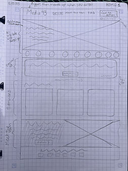
Prototype
Once I had a completed sitemap and organized page information, I got to work preparing a set of wireframes . For the first step of this process, I always start on paper.


test
After creating an initial set of wireframes, I completed usability testing with the team, and a few potential users. Between my initial wireframes and my final wireframes, I learned that the hosting site the company was using, GoDaddy, had extremely limited customization of templates. This meant that I had to change my design as the project progressed, and there were many pages I had to design as I was developing, using the same elements and formatting as similar pages.
Frankie:
-
change fonts and colors to match new branding
-
Only one featured client, and one main image for them.
-
Really likes the breakdown of services.
Mariah:
-
Needs more direct access to contacting for an initial consultation.
-
Footer is too busy
-
Doesn’t like the reviews on the meet the team page
-
Likes the increased usability of home page
Jamie:
-
Doesn’t like the yearbook-style meet the team page.
-
More call to action contact buttons
-
Much clearer header
-
Finding it hard to create a step-by-step “what you get” process for her team
Colton:
-
Wants to see the next events on the home page
-
The meet the team page is too cluttered.
-
Likes seeing what clients the company is working with on the homepage
-
Wants to see more animations instead of click-throughs.
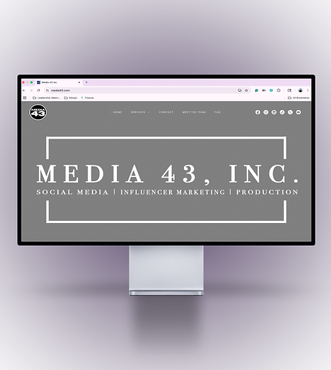
Final site

reflection
Shortly after I completed this project, Media43 was acquired by a larger marketing company, who changed their logo and brand kit. They changed some color on the website from gray and blue to mauve and blue. This created some inconsistiency on their site, but it was not prioritized by leaders to continue to update the website while working on other client sites.
link to current site: https://media43.com/